Moody House Interior Paint Colors: Creating Atmosphere With Intent
Last updated on June 4th, 2026 at 04:12 am
There’s something magnetic about a room wrapped in deep, moody paint—the kind of space that feels instantly calm, slightly mysterious, and surprisingly welcoming. If you’ve ever stepped into a charcoal-coated living room or a forest-green bedroom and thought, “Why does this feel so good?”, you’re not alone. Moody colors have a way of shaping how we experience a space, often more than the furniture or decor ever could.
Many homeowners assume dark or dramatic shades will make a room feel smaller or oppressive, but the opposite is often true. A well-chosen moody palette creates depth, hides imperfections, and gives a space a sense of purpose. Whether you want a reading nook that feels like a secret hideaway or a dining room with an intimate restaurant edge, the right color sets the tone instantly.
21 Moody Interior Paint Colors Worth Considering
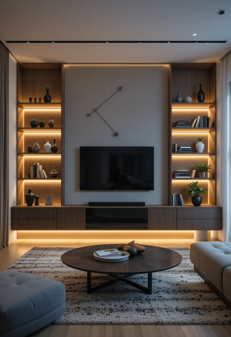
Charcoal Black

A charcoal black wall creates an effortlessly sophisticated backdrop that makes every piece of furniture stand out, especially in modern or industrial spaces where metal and wood tones naturally contrast; it’s also a smart choice for rooms with plenty of natural light, as shadows become part of the design and give the space depth.
This shade has a way of making artwork feel instantly gallery-worthy while anchoring rooms that might otherwise feel unfinished. To recreate this elevated, moody look, start with a rich charcoal interior Wall paint , then layer in contrast with a sleek black industrial floor lamp and a set of minimalist gallery wall frames to create that curated feel.
add warmth with a wood-and-metal coffee table, and soften the overall aesthetic with a neutral textured area rug—these small, intentional pieces bring balance to the bold wall while keeping the space cozy and inviting.
Smoky Navy

Smoky navy paint brings depth without leaning too cold, making it perfect for bedrooms or media rooms. The hint of gray softens the blue, giving it a velvety appearance that feels soothing rather than nautical, especially when paired with a smoky navy peel-and-stick wallpaper for renters who want the look without repainting. Wood furniture in walnut or oak looks richer and warmer against this backdrop, which is why adding a walnut wood nightstand or a mid-century oak tv stand can make the entire room feel more intentional. This shade also pairs beautifully with brass accents, so details like a brass table lamp, gold wall sconces, or a brass round mirror naturally enhance the luxurious mood without feeling flashy. To keep the space cozy and layered, soft textures such as a velvet navy throw blanket, cream faux fur pillows, or a dark blue blackout curtain set work especially well against the smoky tones. If you want the room to feel even more atmospheric at night.
Deep Forest Green

Deep forest green paint instantly creates the sensation of being tucked into nature. It’s the kind of color that looks stunning with leather, stone, and woven textures, especially when styled with a brown leather accent chair that adds warmth and richness to the space. Because it absorbs light in a soft, cocoon-like way, it can make a large room feel intimate without feeling heavy, particularly when paired with a natural woven area rug that softens the room visually. This shade works especially well in home offices where focus and calm are important, and a matte black desk lamp can enhance the moody atmosphere while keeping the workspace functional. Forest green also pairs beautifully with organic textures, so adding a stone-look table vase filled with greenery can make the room feel even more grounded and layered. It also has a timeless quality that doesn’t feel tied to trends, which is why a wood floating wall shelf works so naturally against this deep earthy backdrop.
Oxblood Red

Oxblood paint is bold, dramatic, and unapologetically confident. This color brings a warm, moody intensity that works surprisingly well in dining rooms and entryways, especially when styled with a vintage brass chandelier that enhances the richness of the walls at night. When paired with dim lighting, the walls seem to glow from within, creating a luxurious ambiance that feels even more dramatic with a warm led wall sconce set casting soft golden light across the space. It’s also a stunning choice for vintage or eclectic homes that embrace character, which is why a distressed vintage area rugfits naturally into this type of room design. Dark red tones like oxblood also pair beautifully with darker woods and textured fabrics, making a walnut dining table an easy addition for adding warmth and sophistication. If you want a shade that instantly turns heads, oxblood never disappoints, especially when finished with statement accents like a gold framed vintage wall mirror that reflects the moody atmosphere beautifully.
Storm Gray

Storm gray interior paint creates a beautifully balanced moody foundation for a home, especially when paired with tones like storm gray or ppg paints storm gray interior paint, which enhance its soft depth and subtle tonal shifts throughout the day; this shade works especially well in minimalist spaces that want mood without chaos, and it becomes even more inviting when layered with cozy accents like a soft linen throw blanket in neutral beige or oatmeal, textured linen cushion covers in greige tones, and complementary hues similar to benjamin moore storm cloud gray, all of which add warmth, comfort, and natural texture so the space feels atmospheric, lived-in, and effortlessly stylish.
Midnight Teal

Midnight teal blends the calmness of blue with the richness of green, giving any room a dramatic yet inviting feel. Because it’s so saturated, it acts almost like a neutral when styled with earthy accents. A bold velvet accent chair, matte black wall sconces, dark walnut floating shelves, emerald velvet throw pillows, and a large vintage gold framed mirror all become more visually striking against this deep moody shade. Velvet furniture, in particular, gains a luxurious presence when layered into the space, while warm metallic finishes and rich wood textures keep the room feeling grounded instead of overly dark. People often describe rooms painted in midnight teal as “immersive,” and that’s exactly what makes it special. It transforms walls into a full visual experience rather than just a backdrop.
Cocoa Brown

Cocoa brown creates the kind of rich, cocoon-like atmosphere that instantly makes a living room feel inviting, especially when layered with modern textures and soft lighting. To enhance this earthy and grounded mood, style the space with pieces like the Christopher Knight Home Evelyn Mid Century Modern Fabric Club Chair for warm sculptural seating, the Safavieh Natura Collection Handmade Wool Area Rug to soften the room with organic texture, and the Signature Design by Ashley Valebeck Coffee Table for a rustic-modern focal point. Add depth with the Addlon Industrial Floor Lamp with Amber Glass Shade to create a cozy amber glow in the evenings, then finish the look with the MIULEE Velvet Throw Pillow Covers for that plush, layered feeling that makes cocoa brown interiors feel effortlessly luxurious and relaxed.
Ink Blue

Ink blue carries a poetic quality that feels both calm and intense. It’s an especially beautiful choice for creative studios or reading rooms, where you want a space that encourages quiet focus. Because it borders on black, it pairs easily with most color schemes and finishes. This shade also enhances the look of metallic decor, especially aged brass. Rooms painted in ink blue often feel intentional and thoughtful without needing excessive styling.
Mulberry Plum

Mulberry plum is rich, romantic, and full of personality. It works beautifully in bedrooms, giving the space a cozy, sensual feeling. This color pairs best with soft lighting, which enhances the richness of its purple undertones. When styled with gold or warm wood, it looks luxurious and boutique-like. If you want a color that feels expressive without being too loud, mulberry is a great choice.
Ash Black

Ash black is softer than true black, offering depth without becoming too stark. This shade works well in Scandinavian or minimalist interiors that rely on subtle contrasts. Because it has a powdery appearance, it creates a gentle, moody effect that never feels overwhelming. Artwork and photography stand out cleanly against its matte surface. If black feels too bold for you, ash black is a perfect compromise.
Olive Brown

Olive brown delivers warmth with an earthy, natural aesthetic. It pairs beautifully with terracotta, linen, and rustic wood tones. This color creates a grounded feeling in rooms meant for relaxation or slow mornings. It also hides scuffs and imperfections better than lighter neutrals. For homes that lean toward organic modern or Mediterranean styles, olive brown fits seamlessly.
Blue-Black

Blue-black brings a sleek, modern edge that feels both moody and refined. It’s a fantastic option for bathrooms or hallways where you want a bold statement. The slight blue undertone keeps the color from feeling too flat or cold. This shade works exceptionally well with chrome or silver hardware. People often find that blue-black instantly elevates a space with very little effort.
Graphite Gray

Graphite gray offers a dramatic tone with a whisper of metallic depth. It works well in open spaces where contrast creates structure. This shade brings out the texture in fabrics like wool, tweed, and boucle. It also complements modern artwork and abstract decor beautifully. If you want something dark but not stark, graphite gray gives you richness without weight.
Burnt Sienna

Burnt sienna brings a warm, earthy vibrancy that still reads as moody. It’s especially lovely in southwestern or bohemian-inspired homes. Natural light enhances its reddish depth, giving rooms a glowing quality. This shade pairs well with woven baskets, clay pottery, and desert-inspired decor. It’s a unique option if you want mood with warmth instead of coolness.
Emerald Green

Emerald green feels bold and regal without being overly formal. It creates a strong visual impact in dining rooms or home libraries. This shade pairs beautifully with black and gold accents, offering instant sophistication. Velvet furniture gains extra richness against emerald walls. If you want a color that makes your space feel curated, emerald is a standout choice.
Slate Blue

Slate blue is calm, cool, and slightly brooding. It works incredibly well in bedrooms, giving the space a gentle sense of serenity. Because it’s not overly saturated, it feels sophisticated rather than playful. This shade brings out the beauty of linen bedding and soft neutrals. It’s a mood-setting color that quietly enhances the atmosphere.
Mocha Taupe

Mocha taupe offers a soft moody option for those who prefer neutrals. It creates warmth while still providing a shadowy, enveloping feel. This color pairs well with creams, soft blacks, and natural textures. It’s an especially good choice for homes that want mood without deep color. If moody subtlety is your goal, mocha taupe nails it.
Eggplant Purple

Eggplant purple is dramatic yet unexpectedly elegant. It gives rooms a creative, artistic energy that feels very intentional. This shade pairs best with soft,warm lighting that brings out its depth. Velvet, brass, and marble all look more luxurious against eggplant walls. It’s a daring choice, but the payoff is huge when styled well.
Smoked Brown

Smoked brown delivers a moody, aged effect that feels timeless. It works beautifully in spaces filled with antiques or handcrafted decor. This shade is incredibly grounding and can make large rooms feel more intimate. It softens bright light and enhances shadow play. If you enjoy colors that feel lived-in, smoked brown adds instant atmosphere.
Shadowed Green

Shadowed green sits between sage and charcoal, offering a muted, mysterious tone. It’s perfect for entryways or kitchens where subtle drama is welcome. This color pairs beautifully with matte black hardware and stone countertops. It creates a sense of calm without leaning too earthy or too dark. For homes that favor understated elegance, shadowed green is a clear winner.
Inkberry Black

Inkberry black is rich, complex, and quietly luxurious. It carries subtle blue and purple undertones, giving it a multidimensional appearance. This color excels in rooms with layered lighting where shadows and highlights can interact. It makes modern furniture look even more sculptural. If you want a moody tone that feels refined and artistic, inkberry black is exceptional.
Conclusion
Moody paint colors aren’t just about going dark—they’re about crafting atmosphere with precision. When chosen thoughtfully, these shades can transform a room from ordinary to unforgettable without relying on clutter or trends. Whether you lean toward earthy browns or dramatic blues, there’s a moody tone that fits your style and offers a meaningful shift in how your home feels.