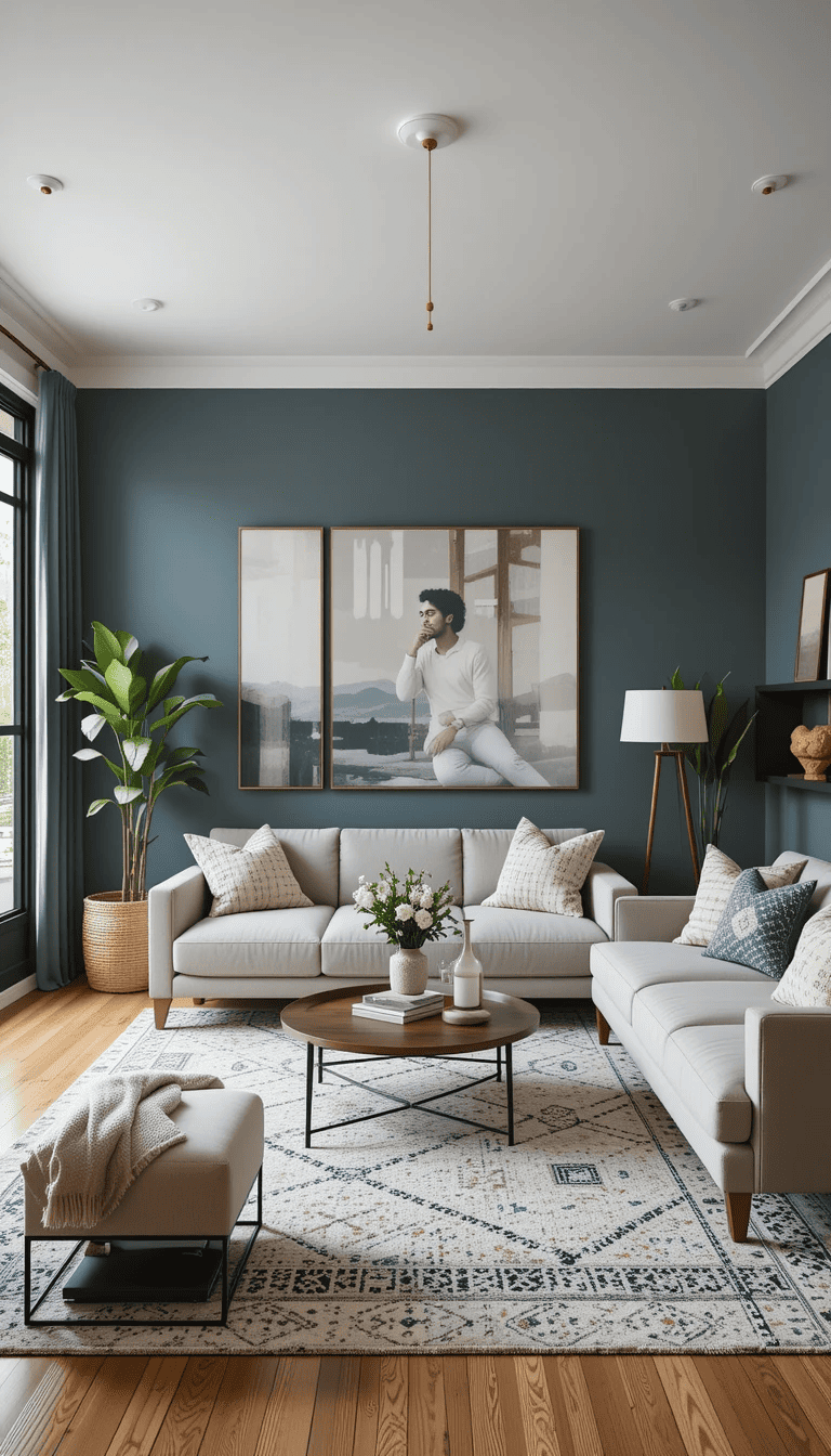
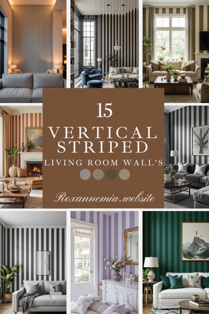
Vertical Striped Wall Living Room Paint Ideas (20 Real-Life Examples That Actually Work)
Last updated on January 9th, 2026 at 04:46 am
If your living room feels flat, cramped, or just a little forgettable, vertical stripes might be the easiest fix you haven’t tried yet. They’re bold without being loud, structured without feeling stiff, and surprisingly flexible across styles. I’ve seen vertical stripes rescue low ceilings, bring order to awkward layouts, and add personality where furniture alone couldn’t. This isn’t about circus walls or outdated wallpaper looks. These are modern, livable vertical striped wall paint ideas you can actually imagine coming home to.
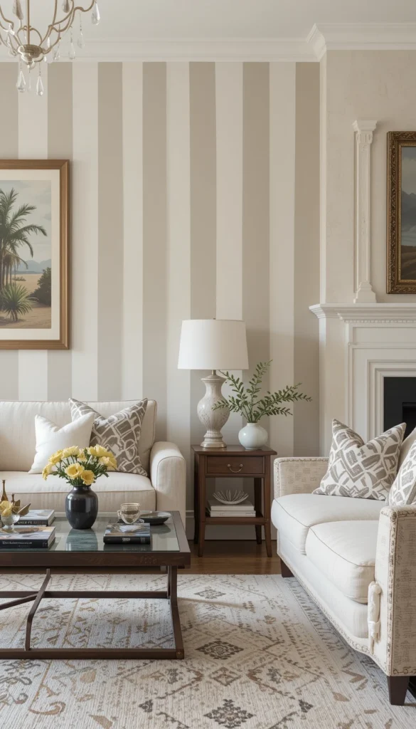
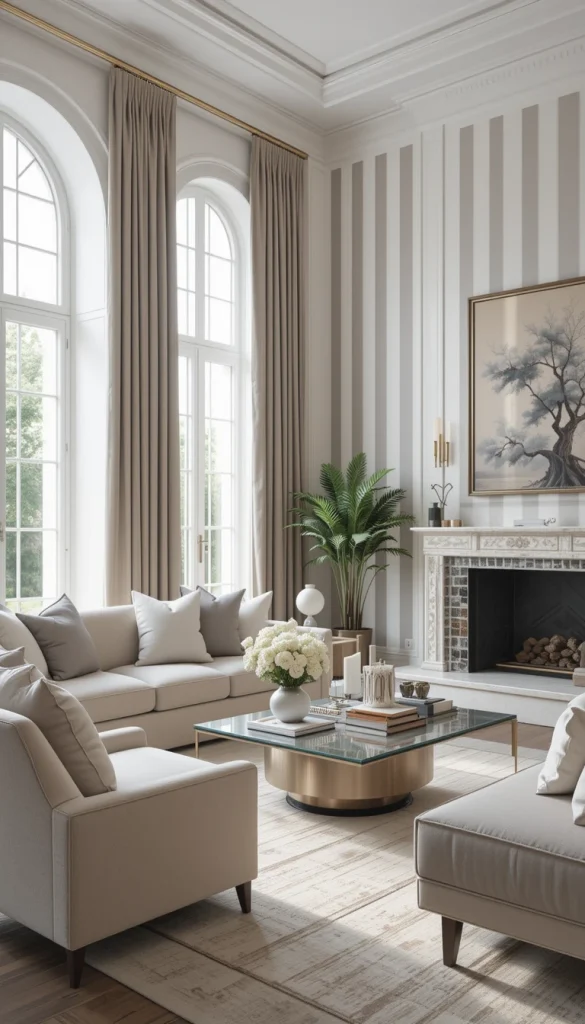
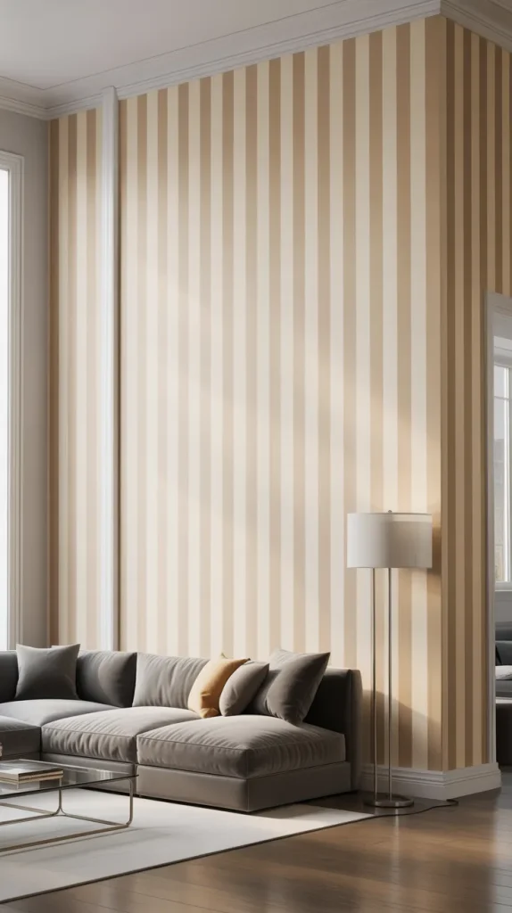
20. Soft Beige and Warm White Stripes for a Calm Base
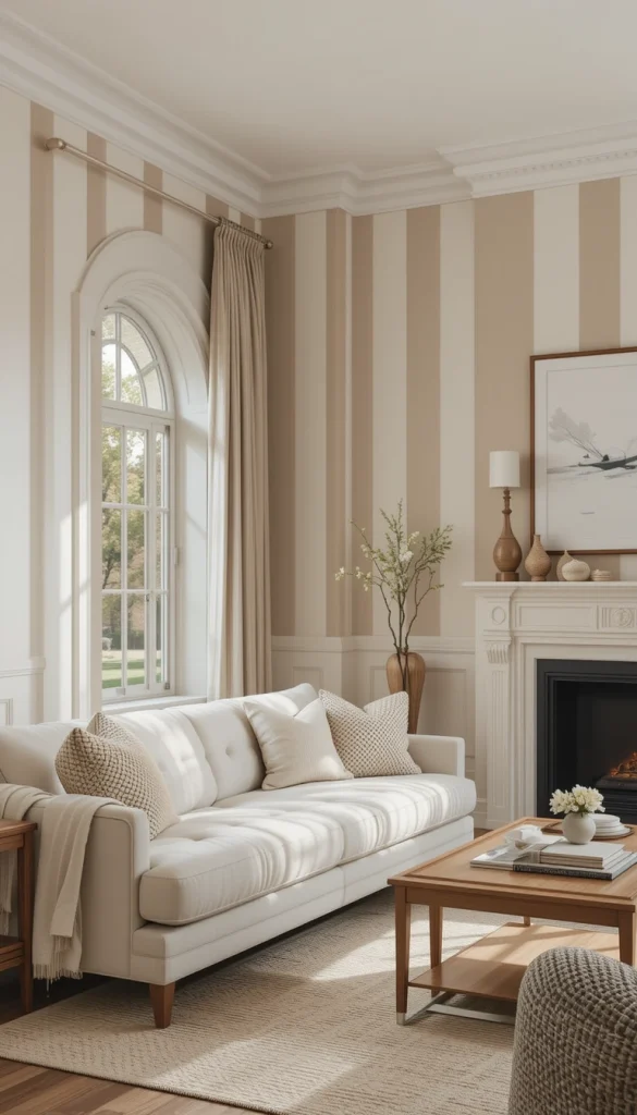
This look uses very subtle contrast to add interest without overwhelming the room. Beige and warm white stripes create gentle rhythm while keeping the space light and welcoming. It’s ideal if your living room already has texture from wood, linen, or woven decor. The stripes quietly stretch the walls upward, making ceilings feel taller. This works beautifully in open-plan homes where you want cohesion, not drama.
19. Light Gray and White Stripes for Modern Apartments
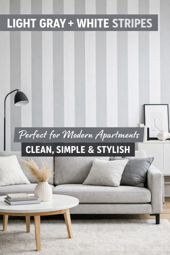
Light gray paired with white feels clean, current, and easy to live with. The vertical stripes add structure to minimalist living rooms that risk feeling too plain. This is especially effective in apartments with limited architectural detail. Gray grounds the space while white keeps it from going cold. The result feels intentional, not decorative filler.
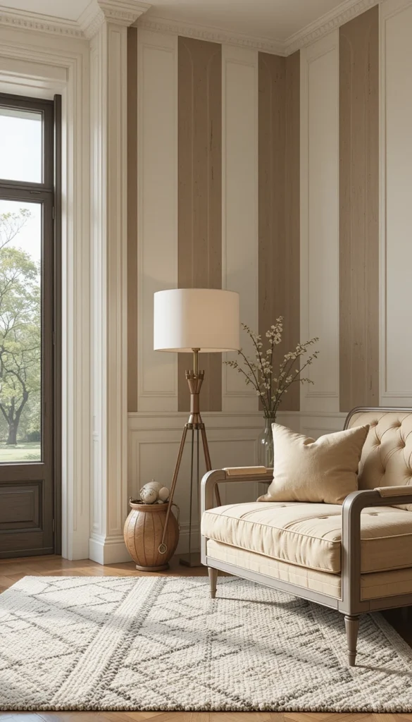
18. Cream and Taupe Stripes for Transitional Living Rooms
Cream and taupe stripes sit perfectly between classic and modern styles. They add depth without clashing with traditional furniture or newer accents. This combo works well in family living rooms where flexibility matters. The vertical lines subtly elevate the space without demanding attention. It’s a smart choice if you redecorate often.
17. Muted Sage and Off-White for a Soft Organic Feel
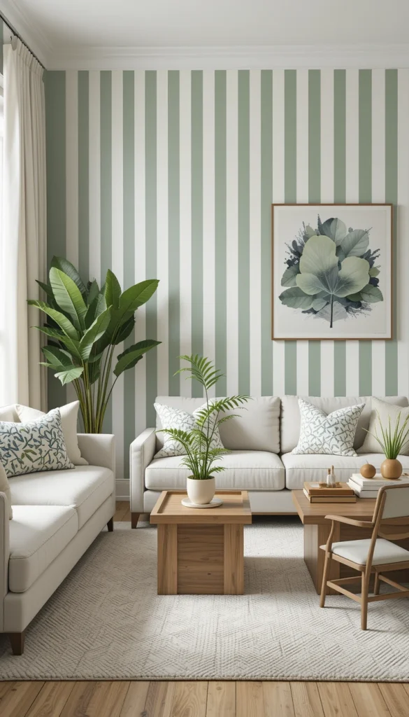
Sage green stripes bring in a natural calm that instantly relaxes a living room. Paired with off-white, the look stays fresh rather than earthy-heavy. Vertical stripes here enhance height while reinforcing a connection to nature. This works beautifully with plants, light wood, and neutral upholstery. It’s peaceful but still visually interesting.
16. Dusty Blue and Warm White for Cozy Elegance
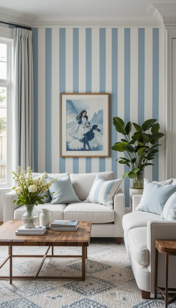
Dusty blue stripes add color without shouting. When paired with warm white, the living room feels calm, layered, and inviting. Vertical stripes help balance darker sofas or heavier furniture. This color combo suits both coastal and modern classic interiors. It feels thoughtful rather than trendy.
15. Charcoal and Soft Gray for a Sophisticated Edge
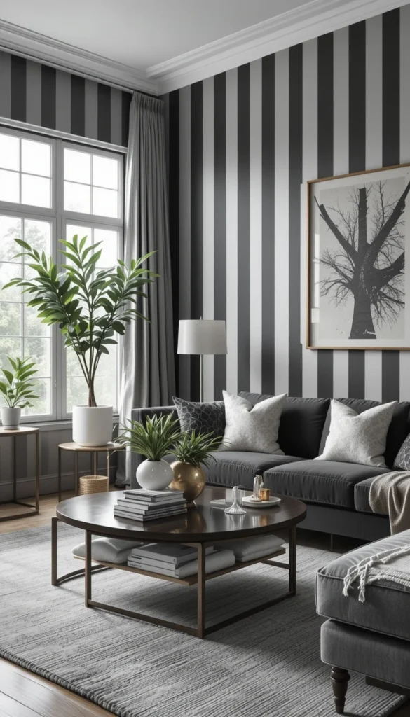
Charcoal stripes instantly give a living room presence. Soft gray balances the depth so the space doesn’t feel boxed in. Vertical lines here create drama while still guiding the eye upward. This works best in rooms with good natural light. Add metallic accents to elevate the look further.
14. Greige and White for Understated Luxury
Greige stripes are perfect if you want something polished but not flashy. They add dimension to white walls while keeping the palette neutral. Vertical stripes here make the living room feel taller and more refined. This is a favorite in modern luxury interiors for a reason. It feels expensive without trying too hard.
13. Blush and Cream for Soft, Modern Warmth
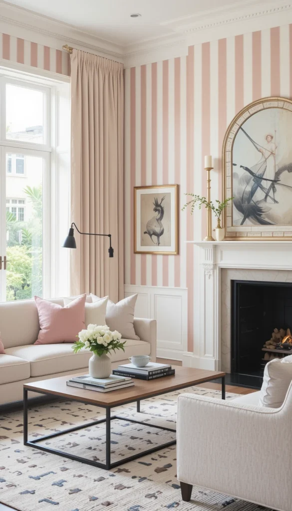
Blush stripes bring warmth without turning the living room overly feminine. Cream keeps the look grounded and elegant. Vertical stripes help blush feel architectural rather than decorative. This works well in contemporary homes with clean-lined furniture. It’s subtle, modern, and surprisingly versatile.
12. Deep Green and Off-White for Nature-Inspired Drama
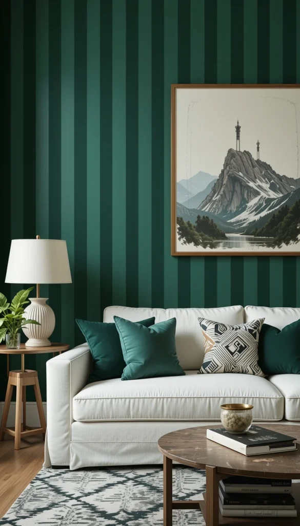
Deep green vertical stripes add richness and depth instantly. Off-white keeps the contrast sharp but livable. This combination works especially well in living rooms with high ceilings. The stripes emphasize height while anchoring the space visually. It feels bold but balanced.
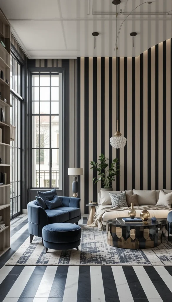
11. Navy and White for Timeless Structure
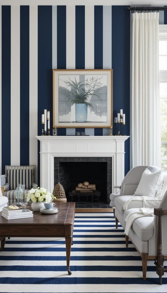
Navy stripes bring strong visual order to a living room. Paired with white, they feel classic rather than heavy. Vertical lines here add height and structure to large walls. This works well in both traditional and modern homes. It’s a safe bold choice that lasts.
10. Tonal Beige Stripes for Texture Without Contrast
Using two shades of beige creates a layered, textured effect. The stripes are visible but never overpowering. Vertical lines subtly lift the space without drawing too much attention. This is ideal for small living rooms that need depth, not distraction. It proves stripes don’t have to be high-contrast to work.
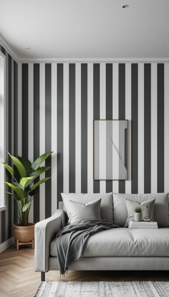
9. Black and Soft White for Bold Modern Impact
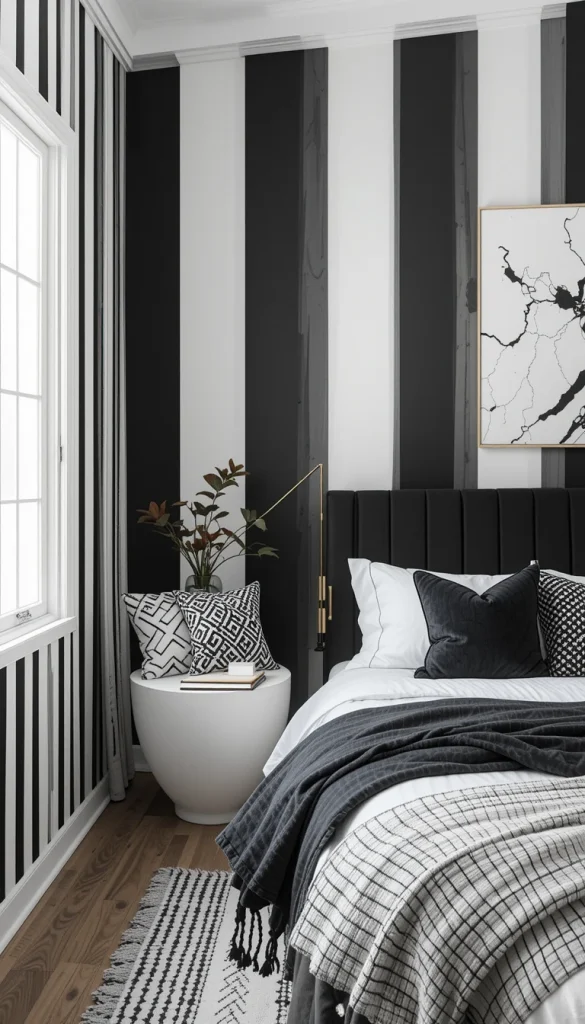
Black stripes add instant drama when used thoughtfully. Soft white prevents the look from becoming too harsh. Vertical stripes help black feel intentional instead of heavy. This works best as an accent wall rather than the entire room. The effect is striking and modern.
8. Muted Terracotta and Cream for Earthy Warmth
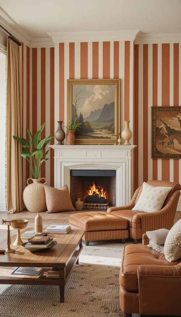
Terracotta stripes bring warmth and personality to neutral living rooms. Cream balances the color so it stays refined. Vertical stripes keep the look architectural rather than bohemian. This works beautifully with leather, wood, and natural textiles. It feels grounded and welcoming.
7. Pale Lavender and White for Subtle Character
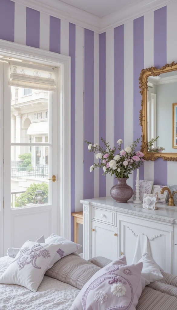
Lavender stripes add color without overwhelming the space. White keeps the palette light and open. Vertical lines help the color read as intentional design, not whimsy. This is a great choice for creative or eclectic homes. It adds charm without sacrificing sophistication.
6. Dark Gray and Warm White for Urban Style
Dark gray stripes feel modern and slightly industrial. Warm white softens the contrast and keeps the room livable. Vertical stripes enhance ceiling height in city apartments. This look pairs well with metal, leather, and minimal decor. It feels sharp but comfortable.
5. Olive and Cream for a Relaxed Modern Look
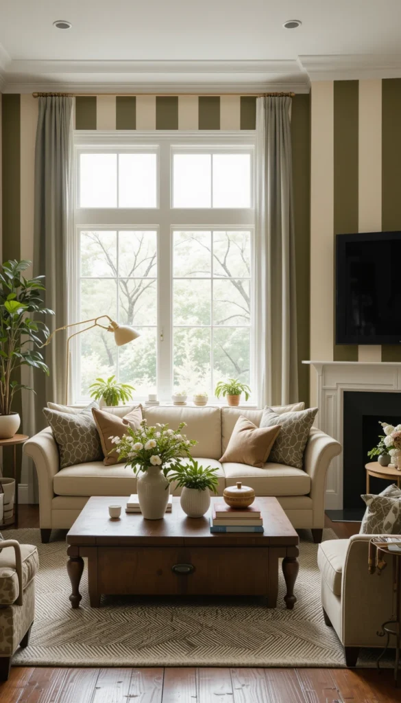
Olive stripes bring depth without the heaviness of darker greens. Cream keeps the space light and approachable. Vertical lines add structure to casual living rooms. This works well in homes that blend modern and rustic elements. It feels effortless and lived-in.
4. High-Gloss White Stripes on Matte White Walls
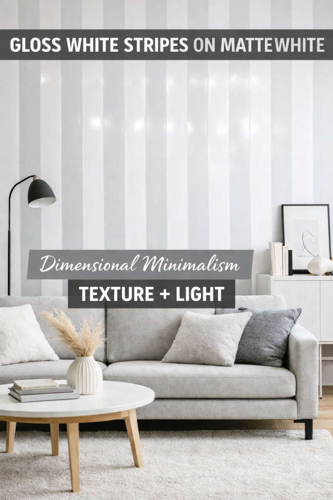
This is all about texture and light reflection. Gloss stripes catch daylight and add movement to the walls. Vertical lines enhance height without introducing color. It’s subtle but incredibly effective in modern interiors. Perfect if you love minimalism with depth.
3. Wide Vertical Stripes for Open-Concept Living Rooms
Wider stripes create a calmer visual rhythm than thin ones. They work especially well in large or open-plan spaces. Vertical orientation helps define the living area without walls. This approach feels intentional and architectural. It’s bold, but not busy.
2. Single Striped Accent Wall to Frame the Sofa
Using stripes on just one wall keeps the look controlled. Vertical stripes behind the sofa naturally draw the eye upward. This creates a focal point without overwhelming the room. It’s a great solution if you’re stripe-curious but cautious. The impact is strong and stylish.
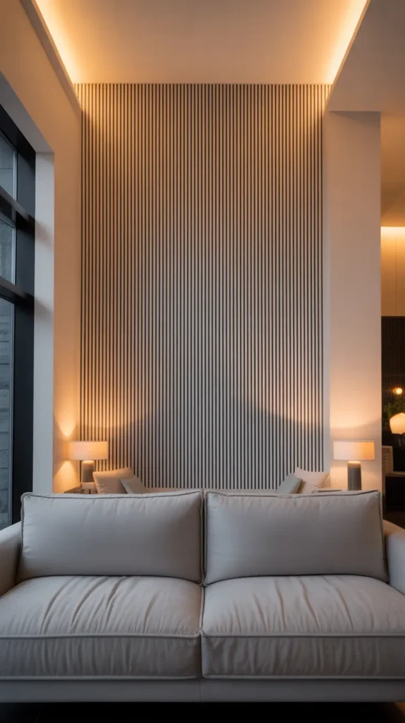
1. Neutral Vertical Stripes That Make the Ceiling Look Higher
This is the most practical and effective approach. Neutral vertical stripes visually stretch the room upward instantly. They work with almost any furniture style or color palette. This is a real-life solution designers use often. If you want impact without regret, this is it.
Conclusion
Vertical striped wall paint isn’t just a design trend—it’s a smart visual tool. Whether your goal is height, structure, softness, or drama, there’s a stripe combination that fits. The key is choosing colors and contrast levels that support how you actually live. When done right, vertical stripes don’t steal attention—they quietly elevate the entire living room.